

Theo’s Tattoos: Daimoku

In March of 2009, when I was putting the finishing touches on the SNitLoE script and designing my Theo tattoo-template, I was also frequenting a meetup.com group of amateur Spanish-speakers in Portland, OR. At the end of one meeting, I found myself being proselytized to (in English, thank goodness) about Japanese Buddhism. The garrulous Buddhist handed me a business card that read “Nam Myoho Renge Kyo,” and proceeded to explain each phrase to me, trying to impart the multi-layered meaning of this concise mantra. (He said “Nam” was a cognate of the English “name,” which I am now 99% sure is false.) I think a simple translation is something like “I’m totally devoted to the Lotus Sutra,” but like many mantras, prayers, etc. it’s clearly got a lot of interpretations.
I saved the card and seized upon the Daimoku as a subject for Theo’s left shoulder – already, I had felt that Theo’s tattoos were a little too Abrahamic. The Japanese script is so complicated to write, I have to refer back to this image every time to refresh my memory – but often, a scribble will suffice.

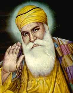
Speaking of scribbles, the only other image on Theo’s left arm I haven’t mentioned yet is a scrawled portrait of the founder of Sikhism, Guru Nanak.

I Use a Ton of Photo-Ref
Before I started this graphic novel in the spring of 2009, I had been very much of an “it’ll do” artist. If a bicycle looked enough like a bicycle to where somebody reading my comic could tell it was supposed to be a bicycle, I had done my job. I even think I was still quite guilty of this lax attitude in the earlier pages of this comic. (What is up with Theo’s drum set on Page 5? NOT one of my better efforts!)
But after reading (and re-reading and re-re-reading) Scott McCloud’s Making Comics (Talmud to the Understanding Comics Torah), I came to the fairly obvious realization that you should know what the thing you’re drawing looks like. This revelation was later reinforced in 2010 by boatloads of advice from the artists at Periscope Studio.

Generally, a greater specificity of research can compensate for shortcomings in your art. If you just draw “a van”, it will come out looking like a white potato on wheels. If you draw a mid-80’s Ford Econoline (as I did), it will end up looking like “a van”. Set out to draw an Arizona Cactus Finch, and you will end up with a passable-looking “bird.” Draw an Ibanez GSRM20 Mikro 4-string bass, and hopefully people will pick up that it is supposed to be a guitar.
Of course, I don’t live in New Mexico – I can’t sketch an agave plant from life, or conjure up the look of a Las Cruces water tank from memory, and that’s where Google Image Search comes in. I’ve done thousands of image searches online and will do thousands more before this is all over. It’s a little tricky, because if your drawing looks too much like a photograph, people will know. Especially if it looks just like the number one image result for that particular search term. (Unless you are deliberately looking for the most ubiquitous, iconic image, like the portrait of Malcolm X.)
I’ve already downloaded quite a lot of images for parts of the comic which I’ve drawn but which you haven’t even seen yet, and some in preparation for parts I haven’t even drawn yet. Here’s a sneak peak to confuse you and whet your appetite for more SNitLoE!

Wonder Woman Day 2010!

Every year, a very cool nerd named Andy Mangels organizes a big charity auction in Portland, OR and Flemington, NJ where people bid on pictures of everyone’s favorite Amazon Princess to raise money for various domestic violence programs. These can be by awesome famous artists like Steve Lieber, Scott Koblish (never heard of him, but that drawing kicks ass!) and the guy who painted what I think is the best entry this year, David Chelsea. Or they can be by schmucks like me who had to look on Wikipedia to determine if Wonder Woman can fly. (And if she can, why does she need an invisible plane?)
I probably should have read David Chelsea’s book on perspective a little more closely before I started my own Wonder Woman artwork, because the burning building on the right still looks a little wonky to me – I’m not sure why, because I constructed my grid pretty carefully. I also feel like the architecture in general has the wrong amount of surface detail, though I can’t tell if it’s too little or too much. I am pretty happy with this piece though, my favorite parts being the firefighter’s gesture and Wonder Woman’s gams.

Please, please, please check out Andy Mangel’s online Wonder Woman Museum. It’s as charming and non-creepy as such a thing could feasibly be, and I have shared but a fraction of the terrific auction artwork on display. And of course, if you are in Portland on October 24th, drop a Hamilton on my artwork, for a good cause. (If it doesn’t sell, I wonder if I get it back? If so, I will put it on my Etsy store and donate the proceeds to Andy when it sells.)
Read MoreWeekend Nudes, non-female edition
This week Hipbone’s model was, gasp!, a man. Because he was older, there were tons of veins and wrinkles – these are half-hour poses, but they could easily have been twice as long, there was so much detail.

(Sorry about the censor blocks – ImageShack, the service I use for hosting the images on this blog, will take them down if they violate their decency standards. I can’t really begrudge them this.)

The guy came up with some really unusual poses.
